
About this project
The world of pharmacies is ruled by the big insurance companies. Contracts to buy medical aids go to the pharmacies with the highest coverage rate or the most orders. Often leaving small independent pharmacies without a say in the matter.
Nafinco, Elke's parent company, set out to be a partner for these small pharmacies, organising them in a cooperation and giving them a seat at the table and access to the same tools the big players have, including a logistical network and a webshop for medical aids.
My challenge
"Design an editor that can be used to run an extended set of quantum network applications and will allow QNE to explain & demonstrate this complex technology."
For us this project started with 6 weeks of research. As the Design Lead for this project I set out a trajectory of workshops, interviews, persona and user journey building, leading up to the development of a proof of concept prototype and a usability test.
To start, we talked a lot with Nafinco on how they wanted to add value. As a company, they add value to the pharmacies, which in turn need to provide value for their clients, the end-users. To design a good product, we needed to take into account all three of them.

During a series of interviews with pharmacists it became clear: getting back the overview on the full landscape of care for their clients was the main driver to participate. Taking back the ordering of medical aids allows hem to better analyse a clients situation, to ultimately take better care of them. A lot of pharmacists described themselves as business owners, so of course a reduction in cost would help.
A series of interviews with (potential) clients yielded muddier results. Asked about their experience with ordering of medical aids, most of them seemed to feel it was going 'just fine'. A bit of digging showed where we could improve: Eliminating trips to the pharmacy and providing better support in order and inventory management. All while maintaining the image of the trusted professional the pharmacies have right now.

All our work came together in a set of persona's and user journey's, one for the pharmacist and one for their client.

We took all the background knowledge we gained (in the meantime we did some research into competitors & benchmarks) into a sketch session based on the design sprint format. Is was incredibly helpful getting the ideas of the entire group of stakeholders on paper, and it served as a great starting point for the design of the UX concept.

We started out with the smallest sreensize, forcing ourself to really think about the hierarchy and the way we presented information. A lot of iterations later we ended up with a concept in prototype, ready to test with some (potential) clients. You can walk through the prototype we tested below in InVision.
View the prototype in InVision

The end of the concept phase was a usability test with potential Elke clients. Six participants came to our office and we spent half an hour with them chatting and using the prototype.


The product we made is specifically targeted at older users (age 65 and up). They're the ones making most use of the medical aids provided by Elke, but they're also the ones least used to new technology and interfaces.
This might be my favourite target group ever to test with. Especially the users in this group surprised us with their fluency on mobile, their life stories and their knack for giving uncensored feedback on whatever is in front of them.
Curious about what we changed in the design bades on these tests? I'll gladly tell you in person!
For my last phase in this project I was involved in defining the roadmap, setting up a sprint planning and organising the final usability tests. After that it was time to hand the project over to designers Sean Hangel (interaction design) and Roy Veldkamp (visual design) who turned it into the great screens you see above
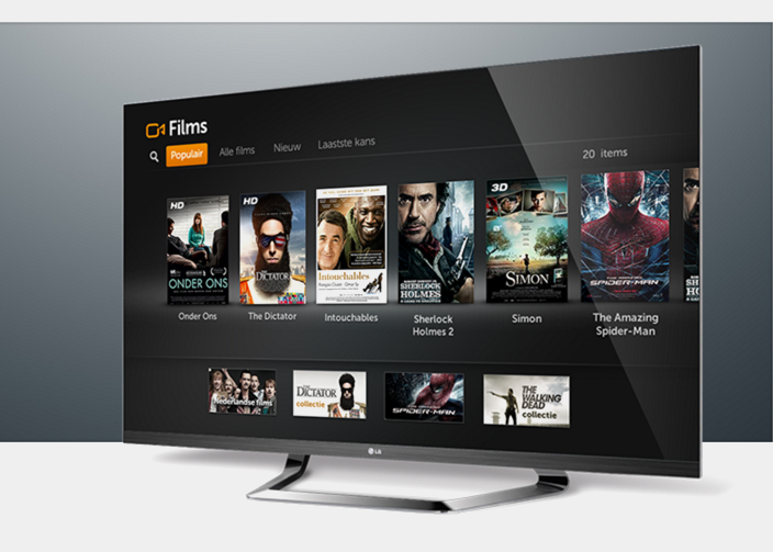 Ziggo - TV Interface in the cloud for Ziggo interactive television
 View this project

 Take me back