About this project
Rituals, one of the leading beauty brands in the Netherlands, expanded their product catalogue with over a 1000 new luxury 'House of Rituals' items. At the same time, the strategic focus of the company shifted, which we wanted to reflect in the way the product catalogue is presented.
This project was brought to life together with a digital campaign design specialist and the art director at Rituals. As the senior UX designer I was responsible for the project approach and planning, the information architecture, navigation wireframes, and the communication to stakeholders.
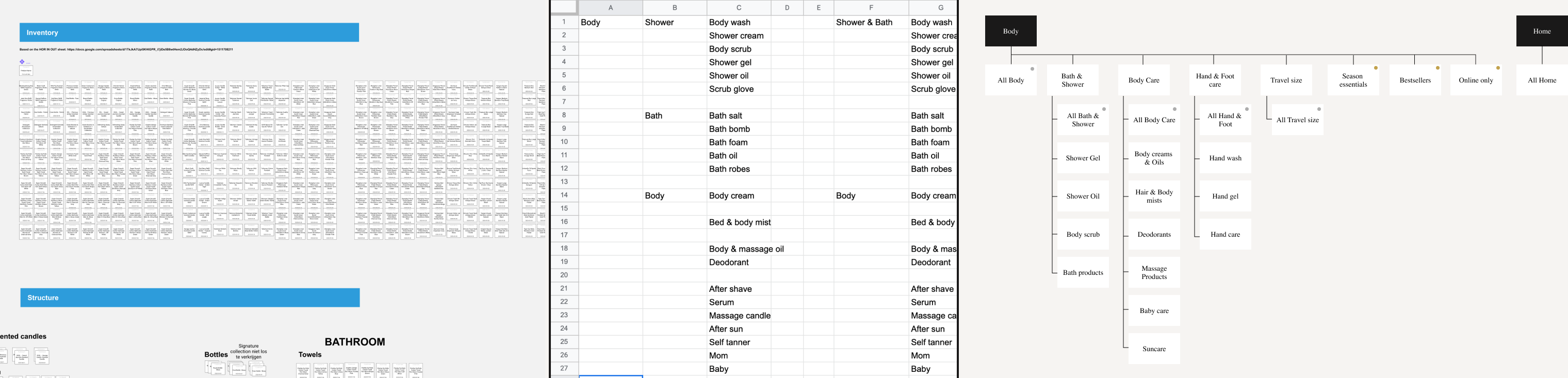
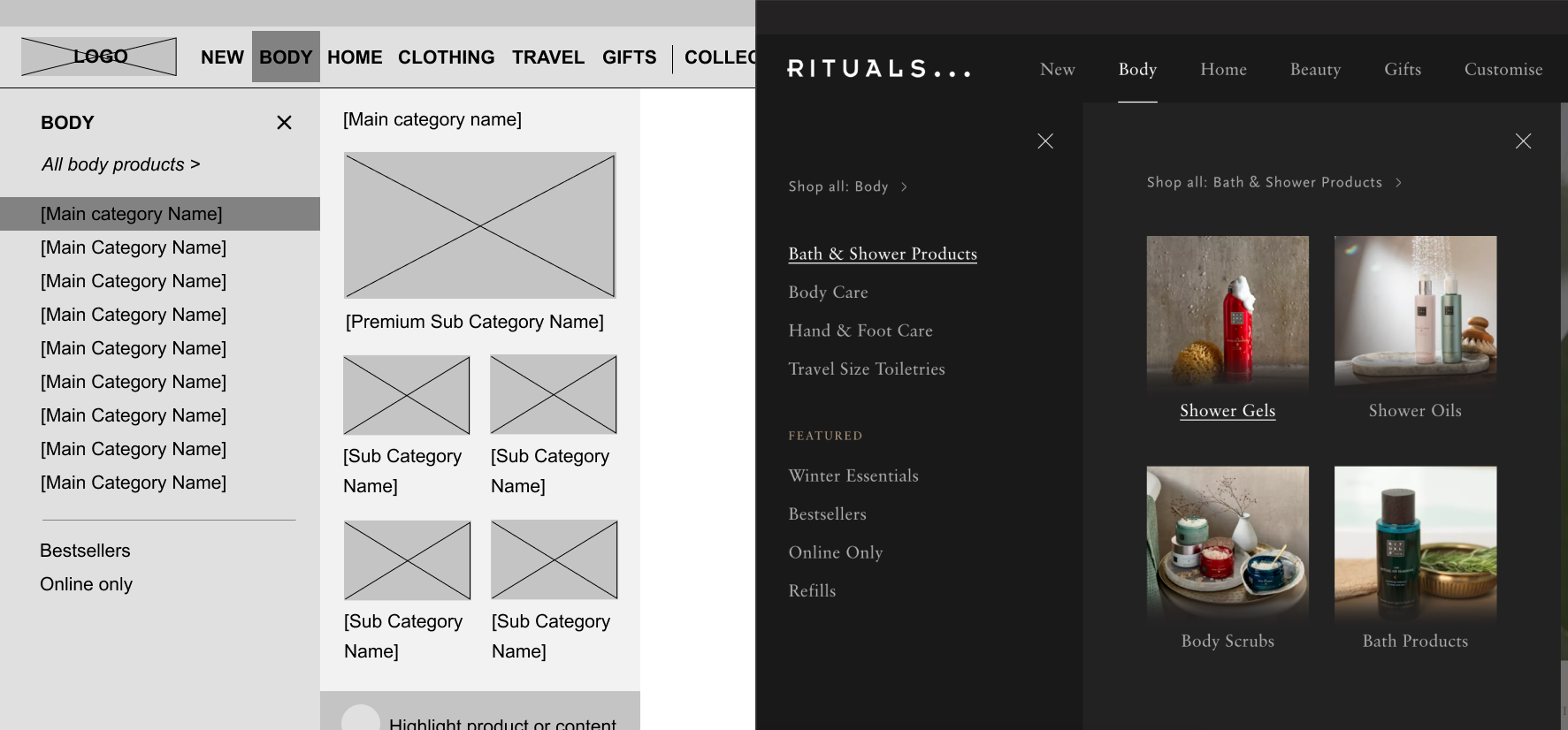
How to categorise over 1000 new products in the catalogue so customers can easily find them? We did a card-sorting session based on an inventory of the new product catalogue.
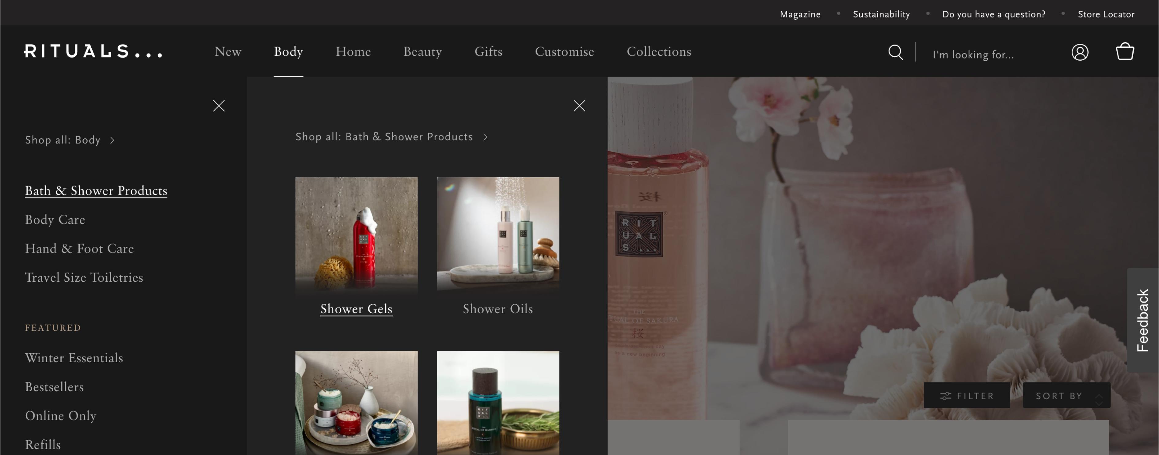
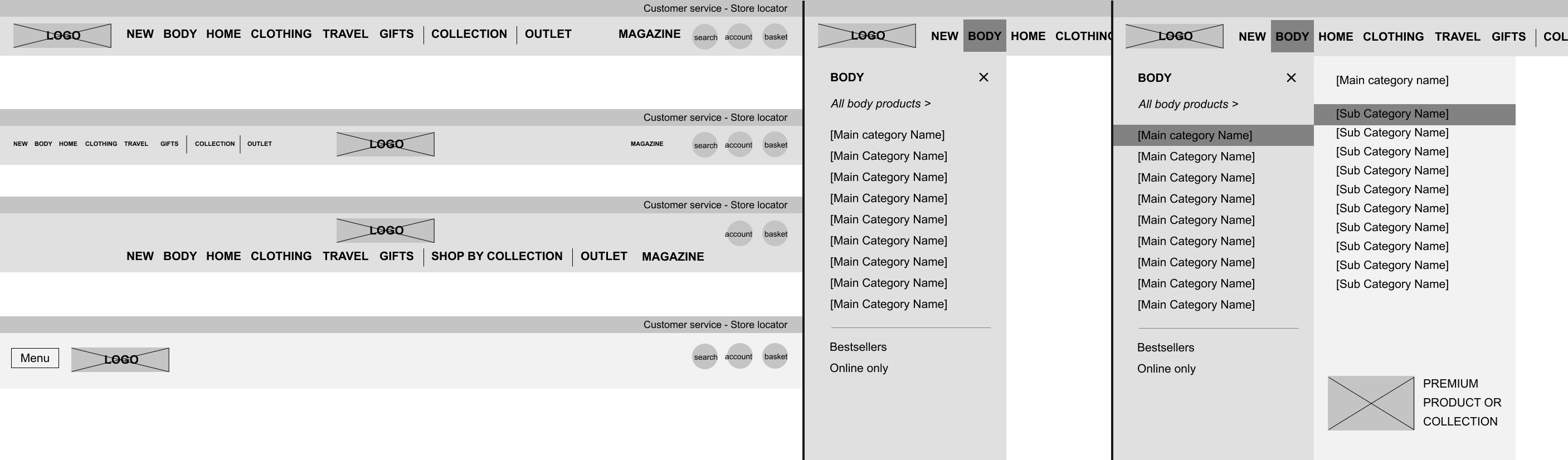
Product type is the most straightforward classification, and analytics and search query's showed a lot of traffic towards specific categories. In addition, the collections play a big role for Rituals. Customers that love one product in a collection, tend to go for other products in that same collection. To account for all these perspective and ensure a high first click right ratio, we created a poly-hierarchical navigation, meaning several main categories can lead to the same detail page for a product.
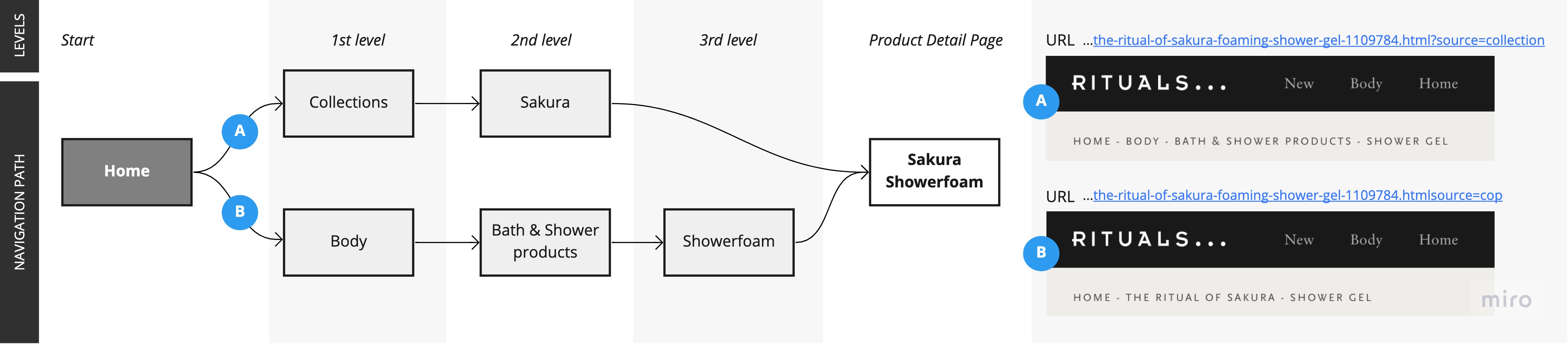
This lead to challenges with the existing breadcrumb navigation on the detail pages. Traditionally, the breadcrumb reflects a single category the product is placed in on the backend. If a customer enters via a different route, there's a mismatch between their navigation path and the breadcrumb content. Creating multiple detail pages with multiple URL's for the same product is not desirable because it muddies the analytics and messes up the SEO for the specific product. In collaboration with developers and SEO experts we designed a flexible breadcrumb component that reflects the users navigation path, no matter what route they take
The 3-click rule might be debunked, it still pays off to offer quick access to bestsellers. For the Rituals catalogue we took a look at the analytics data in combination with the revenue streams per product, to figure out the most important set of products to facilitate access to. The new shallower navigation structure - more main categories, less sub-categories - allowed me to shave clicks of the routes to the most popular products by placing them higher up in the hierarchy or higher up in their dedicated category
The Rituals e-commerce team works tirelessly offering customers interesting promotions and campaigns. The old navigation was not equipped for fast changing highlights in the product catalogue. I provided three ways for the team to include changing promotions, without involving the development team
During this project, in meetings with the e-commerce team, rituals stakeholders and the development team, we noticed the current backend system for filling the navigation was too rigid to incorporate all this. Requests from the team were fuelled by the wireframes and presentations for the navigation possibilities, and ultimately led to a go on updating the backend for the navigation to ensure ultimate sychnronisation
 Elke - Uniting pharmasists with a responsive webshop for medical aids
 View this project

 Take me back